Apocalypse now. #Mobilegeddon is here.
The Mayans couldn’t have predicted this one. Last week, Google rolled out a “mobile-friendly” search algorithm update. This update boosts the ranking of mobile-friendly sites when a search is performed from a mobile phone. Simply put, when your buyers Google from their phones, the results will be optimized for mobile.
The Internet has dubbed this event as #mobilegeddon, and the results could be apocalyptic for companies who are behind the curve on their web experience. Companies whose websites aren’t mobile-friendly—meaning they do not adapt to multiple screen sizes—may not rank in Google search results, regardless of their SEO efforts.
Not sure if your website is mobile-friendly? You can check using Google’s Mobile-Friendly Test.
Website rankings for desktop searches won’t be affected. However, mobilegeddon serves as a wake-up call for organizations who have failed to adapt to the growing needs of their customers. Data from Global Web Index shows that 80% of people use their smartphones to search the Internet. The fact is that your customers are using their mobile devices to try to find your business. The solution? Responsive web design.

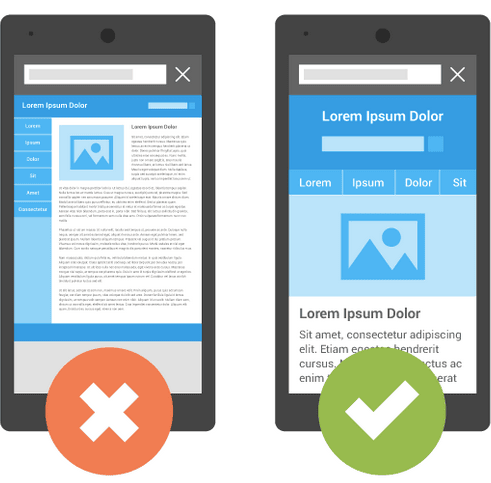
Responsive web design is an approach to web design that delivers an online experience that responds and adapts to various screen sizes (mobile, desktop and beyond) and device capabilities to provide an optimal experience for viewing and interaction. Using fluid images, copy wrapping, column stacking and dynamic content rules delivers a highly custom-fitted user experience.
“It won’t be long before desktop-only experiences become irrelevant. Marketing leaders need to embrace mobile now and should think “mobile first” as they create future-friendly experiences,” says Mark Heine, Vice President, Digital Experience at Quarry.
Don’t forget—responsive web design is not limited to website development. If you truly want to avoid the mobilegeddon, don’t leave your emails behind.